

Here it is, my favorite plot: Home prices compared to average hourly earnings.
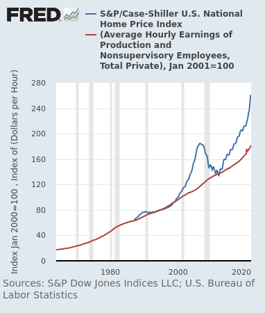
There is just so much to discuss from these two data series. First, notice that housing prices peaked and started to decline before the recession in the 1990s and 2008. Case-Shiller was a leading indicator. Second, notice that the long-term trend for housing prices is actually the average hourly earnings line (but do note that the Case-Shiller data only starts somewhere around the early 1980s). If you had known this fact in 2010-2012, and you had a ton of cash sitting around to buy houses, you could have made an absolute killing.
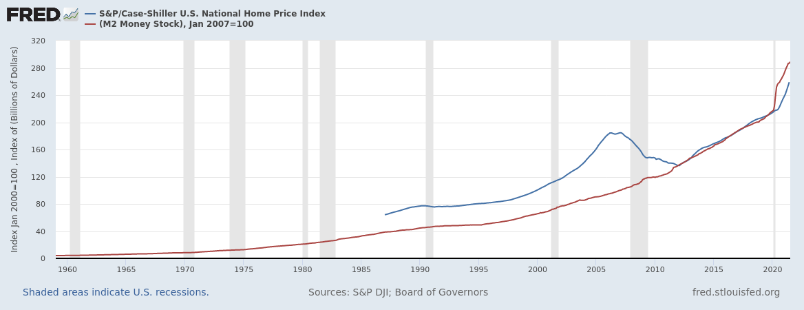
Third, notice the enormous divergence that we currently have between the two lines. Houses are very expensive right now, as I am sure you are aware from experiences in your daily life. Since housing prices are not being driven by increased hourly earnings, there are really only three possibilities for where this new housing demand has come from. (1) Foreign demand is definitely playing a part here, as investors from other countries are certainly buying homes in the US. I do not know exactly how big of an effect this is. (2) Changing preferences of US consumers also definitely has played a role recently, as wealthy renters left cities in 2020 to buy homes in suburbs. I would imagine this portion of demand has cooled a bit lately as COVID restrictions have been lifted. Finally, we come to what I think is the biggest source of upward pressure on housing prices: (3) Federal Reserve activity. By flushing the market with cash (see the plot of M2 money supply below), and by making interest rates incredibly low, the Fed has incentivized institutions (such as BlackRock) to take on debt and buy assets like real estate. Thus, I believe the current “housing bubble” - a term which I am just using as a scary name for the divergence between home prices and hourly earnings - is mostly of the Fed’s making.
That is all for this article: I do not have any hard conclusions or points to make, I just wanted to highlight my favorite data series. I actually find this whole discussion very timely, because China’s real estate market seems to be in deep trouble (just Google Evergrande if you are unaware). The ripple effects from this could be as big as, or even bigger than, 2008. Seriously, this could be it. I am very concerned about what will happen next, and I am currently scouring the internet for data and clues about what the impacts of this collapse will be. I will, of course, write an article if I find out anything big. In the meantime, if you could subscribe and share, I would appreciate it.